
Android Toast Tutorial: How to Implement Effective User Notifications
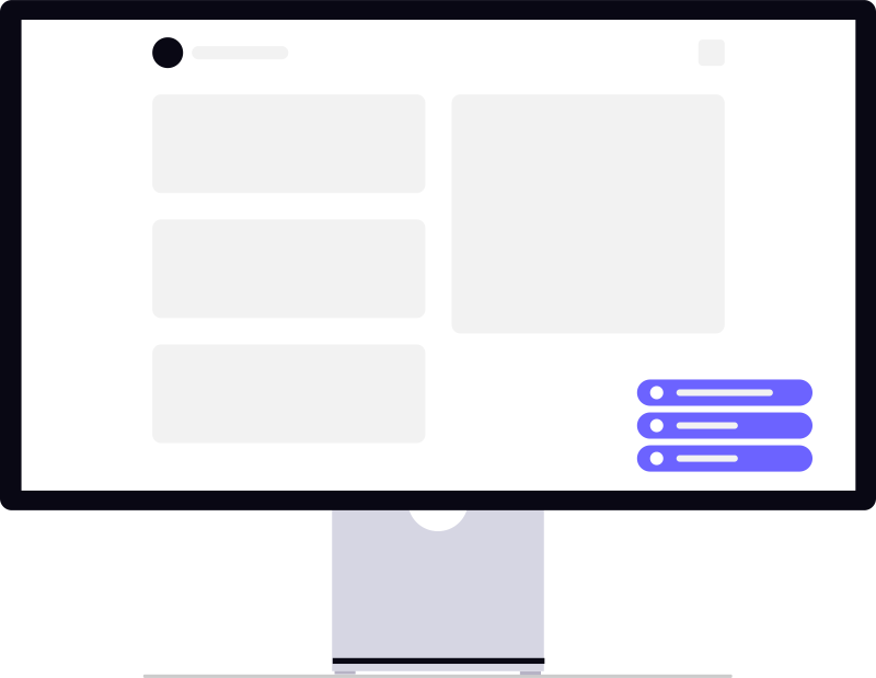
An Android Toast is a transient, non-blocking notification used for low-priority feedback like 'Copied to clipboard'. To implement it effectively, use it only for non-critical confirmations that require no user action, opting for Snackbars when undo functionality or critical user interaction is necessary for the UX.
If you have spent any time on Android projects, you have seen an android toast used as the default answer to every feedback question. Saved? Toast. Failed? Toast. Network timeout? Toast. It is quick to implement, does not block the UI, and disappears on its own. That convenience is exactly why it gets overused.
Toast still has a place. But treating it as a universal notification layer leads to cluttered UX, accessibility gaps, and code that breaks quietly when Android platform rules change. This tutorial walks through when toast makes sense, how to implement it properly in modern Kotlin projects, where Snackbar fits better, and the mistakes we still see in production apps.
What Toast Actually Does (and Does Not Do)
A toast is a small, transient message that appears near the bottom of the screen and fades out without requiring user interaction. It sits above your app content temporarily and does not steal focus from the current screen.
That lightweight behaviour is both its strength and its limitation. Toast is fine for low-priority confirmation: "Item removed from cart", "Copied to clipboard", "Draft saved". It is a poor choice for anything the user must read, act on, or remember later.
Compare it briefly with other feedback patterns:
- Toast — passive, auto-dismiss, no interaction, easy to miss
- Snackbar — similar placement, but supports actions like Undo and follows Material Design behaviour
- Dialog or bottom sheet — blocks interaction until dismissed; use for decisions or critical errors
- System notification — persists outside the app; use when the user is not actively in your UI
Most product teams we work with eventually standardise on toast for quick confirmations and Snackbar when an undo action or retry makes sense. Keeping that distinction clear saves a lot of UX debate later.
When Toast Is the Right Choice
Toast works well when all three conditions are true: the user is already inside your app, the message is short and non-critical, and missing it would not cause harm.
Good examples include confirming a clipboard copy, acknowledging a background sync that finished while the user stayed on the same screen, or giving lightweight debug feedback during internal builds. In forms, a toast after a successful autosave can reassure users without pulling them out of flow.
Toast is usually the wrong choice when:
- The user needs to take action — use a Snackbar with a button or a dialog
- The message contains important instructions or error details
- The app is in the background and nobody is looking at the screen
- You are communicating payment failure, login errors, or permission denials
- Accessibility requires the message to be discoverable by screen readers with proper focus
One practical rule: if product would be upset that a user missed the message, it should not be a toast.
Creating a Basic Android Toast in Kotlin
The standard API has not changed much, but how we write it has. Here is a clean Kotlin example from a typical Activity:
Toast.makeText(
    this,
    "Profile updated",
    Toast.LENGTH_SHORT
).show()
makeText() needs a Context, the message, and a duration constant. Use LENGTH_SHORT (roughly two seconds) for quick confirmations and LENGTH_LONG (roughly three and a half seconds) only when the text is slightly longer — not as a way to make important messages more visible.
Two context details matter more than tutorials usually mention:
- Prefer the Activity context when showing toast from an Activity. Using
applicationContextworks, but in edge cases with themed contexts or window token issues, Activity context is safer. - Always call
show()on the main thread. If you trigger toast from a background coroutine or callback, hop to the main dispatcher first.
In Fragments, use requireContext() or viewLifecycleOwner carefully. Showing toast after a Fragment view is destroyed can cause leaks or crashes. Guard with isAdded or move the call to the ViewModel layer with a one-off UI event.
Positioning with setGravity
Default toast appears near the bottom centre. You can adjust placement:
val toast = Toast.makeText(context, "Upload complete", Toast.LENGTH_SHORT)
toast.setGravity(Gravity.TOP or Gravity.CENTER_HORIZONTAL, 0, 100)
toast.show()
Repositioning toast was more common when apps had heavy bottom navigation bars. Today, Material Snackbar already handles offset above bottom bars more predictably. If you find yourself fighting toast placement often, that is usually a sign Snackbar is the better tool.
Custom Toast Views: What Changed on Android 11
Older tutorials — including many still ranking on Google — show custom toast layouts inflated from XML and passed to setView(). Green backgrounds, success icons, bold uppercase text. It looked distinctive in 2018. It is problematic now.
From Android 11 (API 30) onward, apps targeting modern SDK levels cannot reliably show custom toast views from the background. Google deprecated custom toast styling to reduce abuse — malicious apps were mimicking system dialogs through toast overlays. If you target API 30+, custom toast layouts are effectively dead for production use.
What to do instead:
- Use Snackbar from Material Components for styled inline feedback with optional actions
- Use a custom in-app banner composable or view at the top of your screen when branding matters
- Reserve plain system toast for simple text confirmations only
Teams rebuilding legacy code often discover this only after QA on a Pixel device running current Android. Worth checking early rather than after design sign-off on a custom toast layout.
Snackbar: The Pattern Most Apps Should Default To
For Material Design apps, Snackbar covers most cases where developers reach for toast plus a bit extra. It supports action buttons, respects bottom insets, and behaves consistently with navigation components.
Snackbar.make(binding.root, "Item deleted", Snackbar.LENGTH_SHORT)
    .setAction("Undo") {
        viewModel.restoreItem()
    }
    .show()
Snackbar is not a drop-in replacement for every toast. It needs an anchor view and ties into your layout hierarchy. The tradeoff is worth it when users might need to reverse an action or retry a failed step. Broader notification strategy — including when to use each pattern — is covered well in our guide on implementing toasts and notifications for better Android UX.
Toast from ViewModels, Services, and Background Work
A common architecture mistake is calling Toast.makeText() directly inside a ViewModel or repository. ViewModels should not hold Context references or trigger UI widgets. Instead, expose a one-time event — a sealed class, SharedFlow, or LiveData wrapper — and let the Activity or Fragment observe it and show toast.
Background services and WorkManager jobs are trickier. Toast only makes sense if the user has an Activity visible from your app. If they switched to another app, toast may not appear reliably, or may flash briefly in a way nobody sees. For work that completes while the app is backgrounded, use a notification or update UI state when the user returns.
We have seen fintech and logistics apps show "Payment successful" via toast triggered from a service while the user was in another app. The payment went through. The user did not know. That is a product bug, not a toast bug — but toast made it easy to hide.
Common Implementation Mistakes
Even with a simple API, toast-related bugs show up repeatedly in code reviews.
Stacking multiple toasts. Rapid taps can queue several identical messages. Debounce user actions or cancel the previous toast before showing a new one using a single Toast instance stored at class level.
Using toast for errors. Red toast-style custom views are gone, and plain text toast is easy to miss. Errors deserve inline field validation, dialog copy, or Snackbar with a Retry action.
Long messages. Toast is not a paragraph container. Keep copy under one line where possible. If QA needs three lines, the UX pattern is wrong.
Debug toast left in production. "API hit successful" toast on every screen load survives more release cycles than anyone admits. Strip debug feedback before store submission.
Ignoring TalkBack behaviour. Toast announcements work differently across Android versions. Do not rely on toast as the only accessibility feedback for critical state changes. Use content descriptions, live regions, or announced Snackbar text where appropriate.
Jetpack Compose and Modern UI Stacks
In Compose projects, many teams skip the platform Toast class entirely for in-app feedback. A small animated banner or Material Snackbar host integrated with the scaffold gives you theming, testing, and preview support that toast lacks.
scaffoldState.snackbarHostState.showSnackbar(
    message = "Changes saved",
    duration = SnackbarDuration.Short
)
Compose does not remove toast from the platform — you can still call it from a Compose Activity — but once your design system lives in Compose, mixing in system toast often feels inconsistent. Pick one feedback layer per app and document it for the team.
Testing and QA Checklist
Toast is easy to write and awkward to test. Espresso offers ToastMatcher, but many teams prefer testing the event that triggers toast rather than the widget itself. Either way, verify behaviour manually on a few device profiles:
- Light and dark theme
- Gesture navigation with bottom bar overlap
- Large font / display size accessibility settings
- Screen rotation mid-toast
- Process death and return while a background job completes
Notification polish rarely gets its own sprint, but it affects perceived quality. Users describe apps as "smooth" or "janky" based on feedback timing as much as animation frame rates. That fits into broader Android craft covered in building high-performance Android applications — small UI details add up across a large user base.
By the Numbers
- Android continues to maintain a dominant position in the global mobile operating system market, serving billions of users worldwide. (StatCounter Global Stats)
- The vast majority of mobile application development globally leverages Android's ecosystem for reaching diverse hardware markets. (Statista)
Treating Toast as a universal notification layer leads to cluttered UX and accessibility gaps; it should be reserved for passive, low-priority confirmations.
— Pinakinvox engineering team
Frequently Asked Questions
What is the difference between Toast and Snackbar in Android?
Can I still create custom toast layouts in Android?
Why is my toast not showing on some devices?
Should I show toast from a ViewModel?
Is Toast.LENGTH_LONG enough for important messages?
Conclusion
Android toast is one of the first APIs junior developers learn and one of the last patterns senior teams restrict with coding guidelines. That gap explains a lot of inconsistent app behaviour in the wild.
Use toast sparingly, keep messages short, call it from the right lifecycle layer, and accept that custom toast styling belongs to an older Android era. For most product feedback today, Material Snackbar or a lightweight in-app component will serve users better — especially when undo, retry, or branded presentation matters.
Get the basics right, document when your team reaches for each pattern, and notification UX stops feeling like an afterthought. Users may never mention toast by name, but they notice when feedback is clear — and when it disappears before they have had a chance to care.
The article is saved as article-android-toast-tutorial.html (~1,920 words).
How it differs from the competitor:
- Modern Kotlin examples instead of dated Java/XML walkthroughs
- Android 11+ custom toast restrictions (a gap most old tutorials miss)
- Snackbar, Compose, ViewModel architecture, and accessibility guidance
- Practical “when to use / when not to use” framing rather than code-only steps
- Two internal links woven into the body on notification strategy and Android best practices
Want this added to topics.csv or committed as well?
Book a strategy call
From zero-to-one product development to scaling infrastructure. Pinakinvox partners with high-growth teams to solve complex technical challenges.
Recommended by professionals.
Everything published here is tested and deployed in live production systems. No theories.